
Design
Designer Resources and Information
Images
Embedding Images Into Your Design:
In Adobe Illustrator, you have the option of linking images or embedding them directly into the document. If you choose to link your images, please make sure that you include the images with your final artwork so that we can print your file correctly. The easiest way to include images is to embed them directly into the document.
The video below shows an excellent tutorial on linking or embedding images into your Illustrator document.
Using Copyrighted Images or Fonts:
It is important to make sure that you obtain the correct license to use all graphics in your design or artwork. Typically images found through Google or other search engines are copyrighted and not available to use in commercial projects. In addition to copyright issues, most pictures found online are low resolution images which will not look good when printed. If you purchase or license high resolution photos or artwork from a stock photo website, you should be able to use the image or art in your design. Be aware that some stock photos have restriction on usage or the number of printed copies that can be created.
Additionally, make sure all fonts used in your design are available for commercial use. Often free fonts found online are licensed for personal use only, but many free high quality fonts found online can be used commercially. If in doubt, contact the font creator for permission to use the font commercially and when possible obtain written authorization for use in your specific design.
Image Size and Resolution:
Images used for print design should be at least 300 dpi. Most online images are only 72 dpi. If a low resolution image is used for print, it will often create a blurry or pixelated image. For the most professional look, make sure your photographer or stock photo website provides you with images which are 300 dpi resolution or higher. This is particularly important for large format projects where an image will be printed at bigger sizes.
Fonts
When deciding which fonts to use, it's important to keep in mind these considerations:
- Final size of the printed project
- Background color or images
- Substrate used for the project
Font Size:
As a general rule, font size should never be smaller than 6 pt. for easy readability. If text will be printed at a smaller size (such as text on business cards,) make sure your font is thick enough and simple enough that the text will still be clear. For basic flyers, brochures, or other informational print projects, the font should be at least 10 pt. for clarity.
Background:
If text will be printed over a background image or colored background, make sure the font used is thick enough to be read and that there is enough contrast for easy readability. If your background is busy, it's important to pay close attention to the spacing between letters. If your text will be embossed or foil stamped, it will need to be substantial enough to maintain the integrity of the text design during the heating process.
Substrate:
Keep in mind that designs intended for print on a textured background will need to be carefully chosen. If your font will be cut out as vinyl lettering or dimensional, select a thicker font for the best results.
A good way to confirm that your text can be read with the selected font is to print out your design on a home or office printer. At McNeil Printing, we do our best to inform you if we see a potential problem with the fonts or images to ensure a beautiful final product.
Creating Outlines From Fonts:
Before sending a document to your printer, it is important to turn your text layers into outlines. We may not own the font you used to create your artwork, which means your text won’t show correctly on our computers. If you turn your text into outlines, it creates a vector shape from your text which will show perfectly even if we do not have your font installed on our computers.
Here’s a quick way to turn your text into outlines before saving your final document.
Please note:
Once you turn your text into outlines, you will not be able to edit them with your text editor tool. We recommend saving an editable version of your document before turning your text into outlines!
Using Adobe Illustrator CC:
Step 1: Select your text layers. At the top of your screen, click on Select, select Object, and then select All Text Objects.
Step 2: Create outlines of your text. At the top of your screen select Type and then select Create Outlines.
Using InDesign CC:
Step 1: Select your text layers.
Step 2: Select Type and then click on Create Outlines.
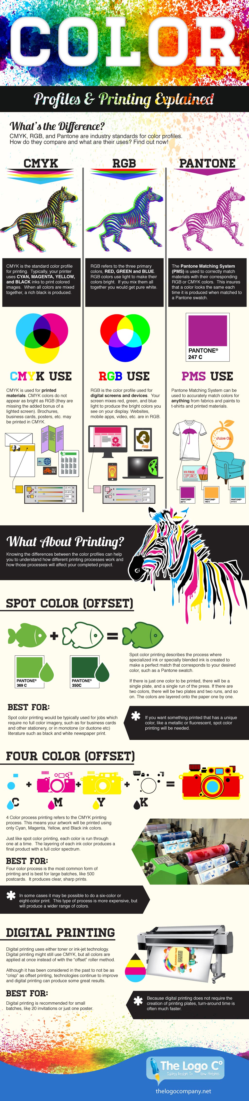
Color Profiles
If you’re in marketing or design, then you’ve probably experienced a moment when you realized that your carefully crafted design didn’t print or display the way you expected and now you’re facing the problem of having a website, business cards, or brochures that don’t quite match your brand colors.
As you know, maintaining a strong brand means keeping a consistent visual identity. Understanding the difference between various color profiles will help you to set up your files in the proper format to achieve consistent colors across a variety of media.
RGB Color Profile:
When your design will appear on a digital device (such as a tablet, computer screen, or phone), your ideal profile will be the RGB color profile. RGB colors have the widest range of color possibilities and look brilliant when lit up on a screen, so they are your best choice when designing online ads or websites.
This color profile has the base colors of Red, Green, and Blue.Typically in RGB format, a color is defined by assigning a value between 0 and 255 for each base color. For example, a navy blue color would be: R=43 G=54 B=110. RGB colors are also often exressed as hexadecimal codes preceded by a hashtag. For example, a forest green would be expressed like this: #376839.
CYMK Profile:
When designing for a printed format, the best color profile to use is CMYK, which uses the base colors of Cyan, Magenta, Yellow, and Key (or Black). These colors are usually expressed as percentages of each base color, for example a deep plum color would be expressed like this: C=74 M=89 Y=27 K=13.
If you’ve ever changed the ink in your personal inkjet printer, you’re probably already familiar with the colors in the CMYK profile. These four colors combine to print in vivid rich colors and can achieve the deepest black. They are excellent for any kind of digital or offset printing from business cards to posters and signs.
Pantone Profile:
The Pantone Profile is a proprietary matching system (PMS) developed by The Pantone Corporation in 1963 and has become the industry standard for defining a spot color as opposed to mixed colors.
While it doesn’t always work for digital printing, pantone colors are a good way to define and preserve specific colors to maintain brand integrity. They are particularly useful when using offset printing for something like a logo or letterhead which involves only a few solid spot colors.
Choosing Color Profiles:
Since you’re going to need a variety of both digital and printed material for your brand, it’s helpful to know the most effective color profile for your project. It’s also important to be able to convert your project format to any profile to maintain brand consistency.
Keep in mind that getting a perfect color match can be challenging because many of the colors in an RGB format simply aren’t available in a CMYK profile. Also, specific pantone colors like bright blues and oranges may not have an exact match in CMYK. If you’re developing a brand or ad campaign, you should take into consideration the limitations of your specific colors. For more information or assistance preparing your design files for print, please contact us and we will be happy to help!
Here's a quick reference image!
Files
Our preferred design file format is a print-ready pdf. We will accept Illustrator, InDesign, Photoshop, or Canva files as well, but the best way to send us your artwork is by uploading a print-ready pdf through our website or by emailing the final pdf to your sales rep.
To send us print-ready files, you will need to save, export, or package your design for us. Here’s the way you do this in each of the most popular design programs including:
- Illustrator
- InDesign
- Photoshop
- Canva
Illustrator
InDesign
Photoshop
Canva